Healthene
Scalable Design System

01
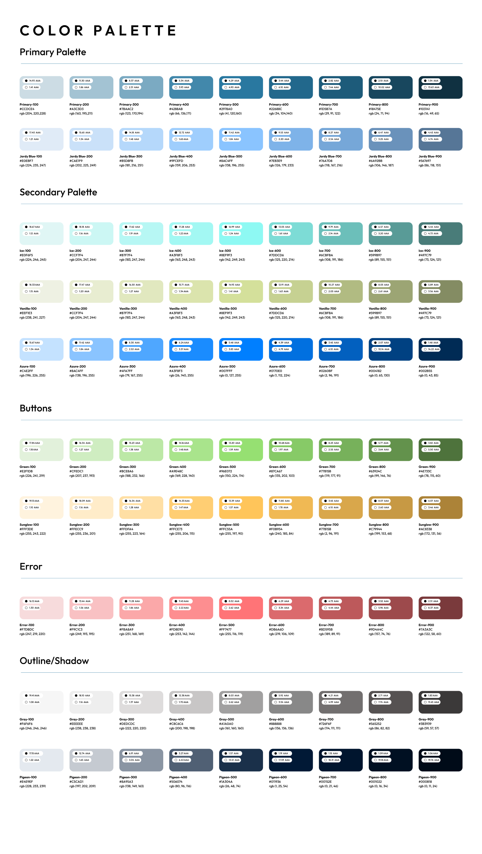
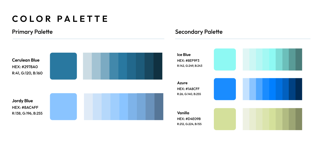
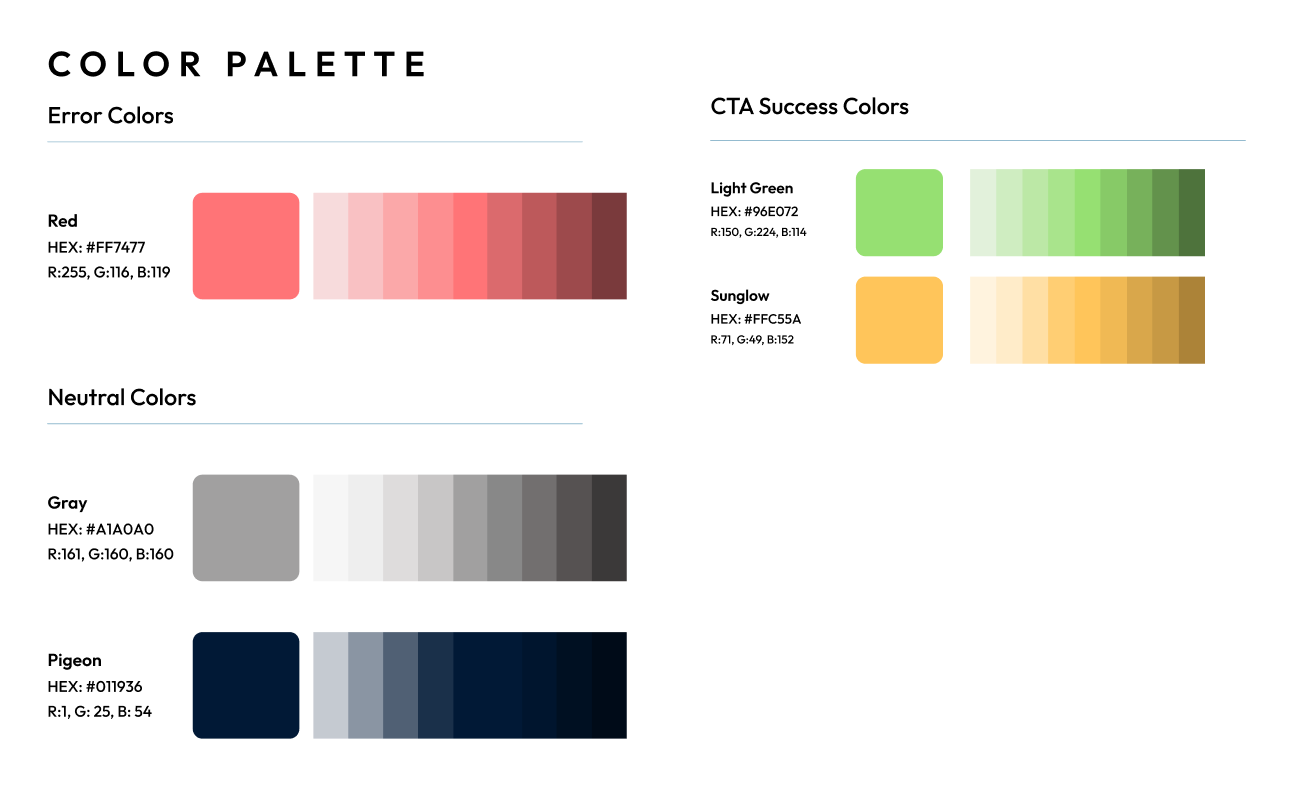
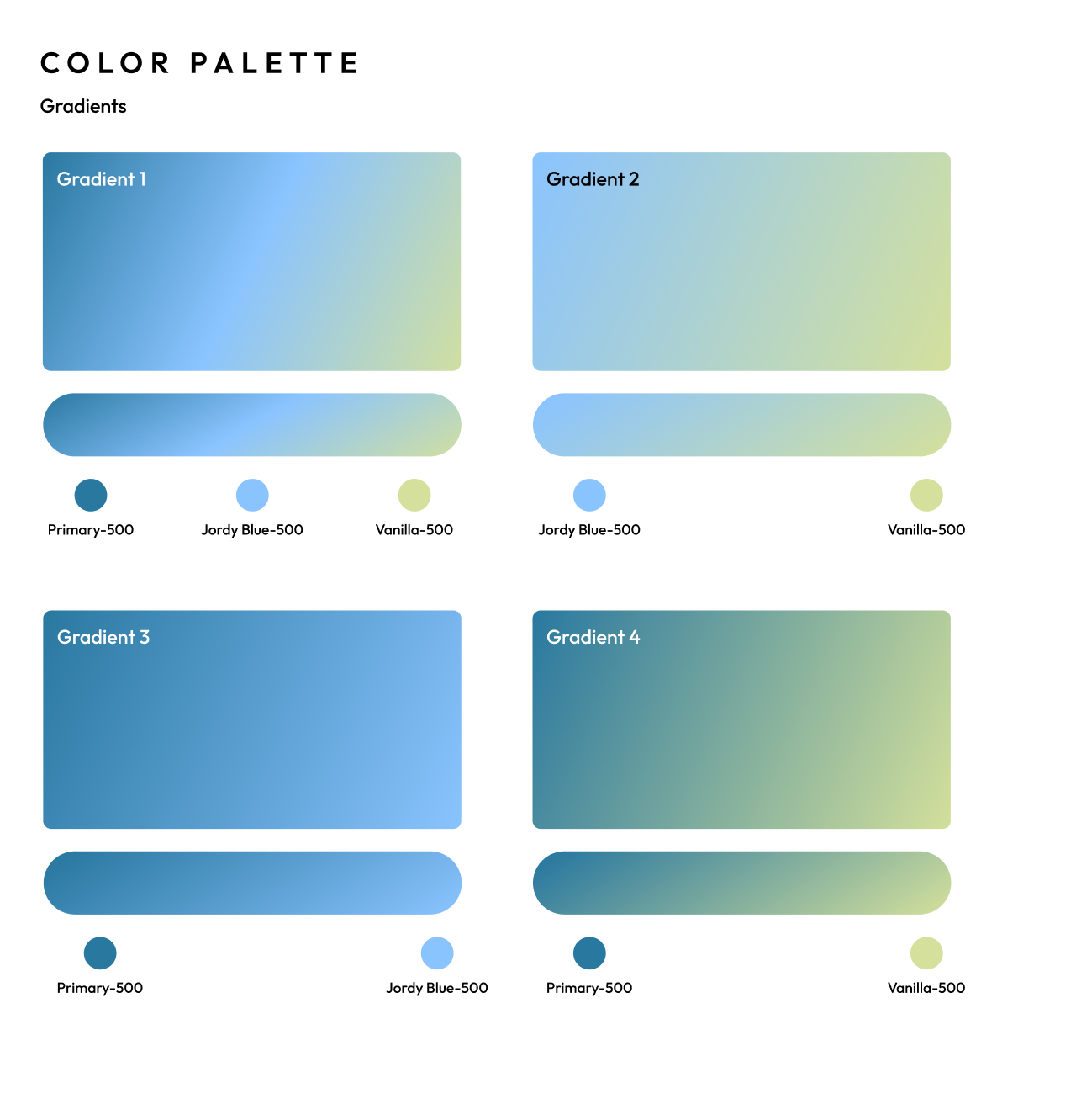
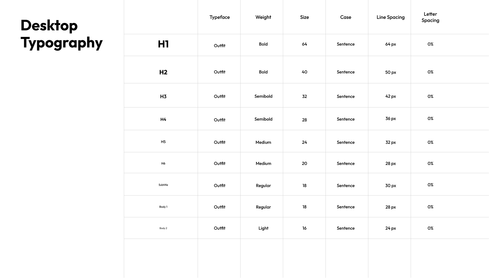
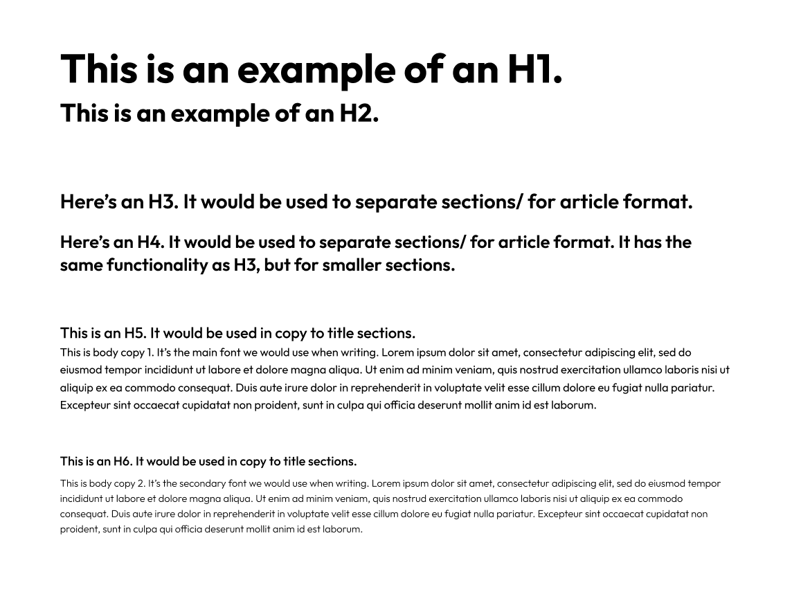
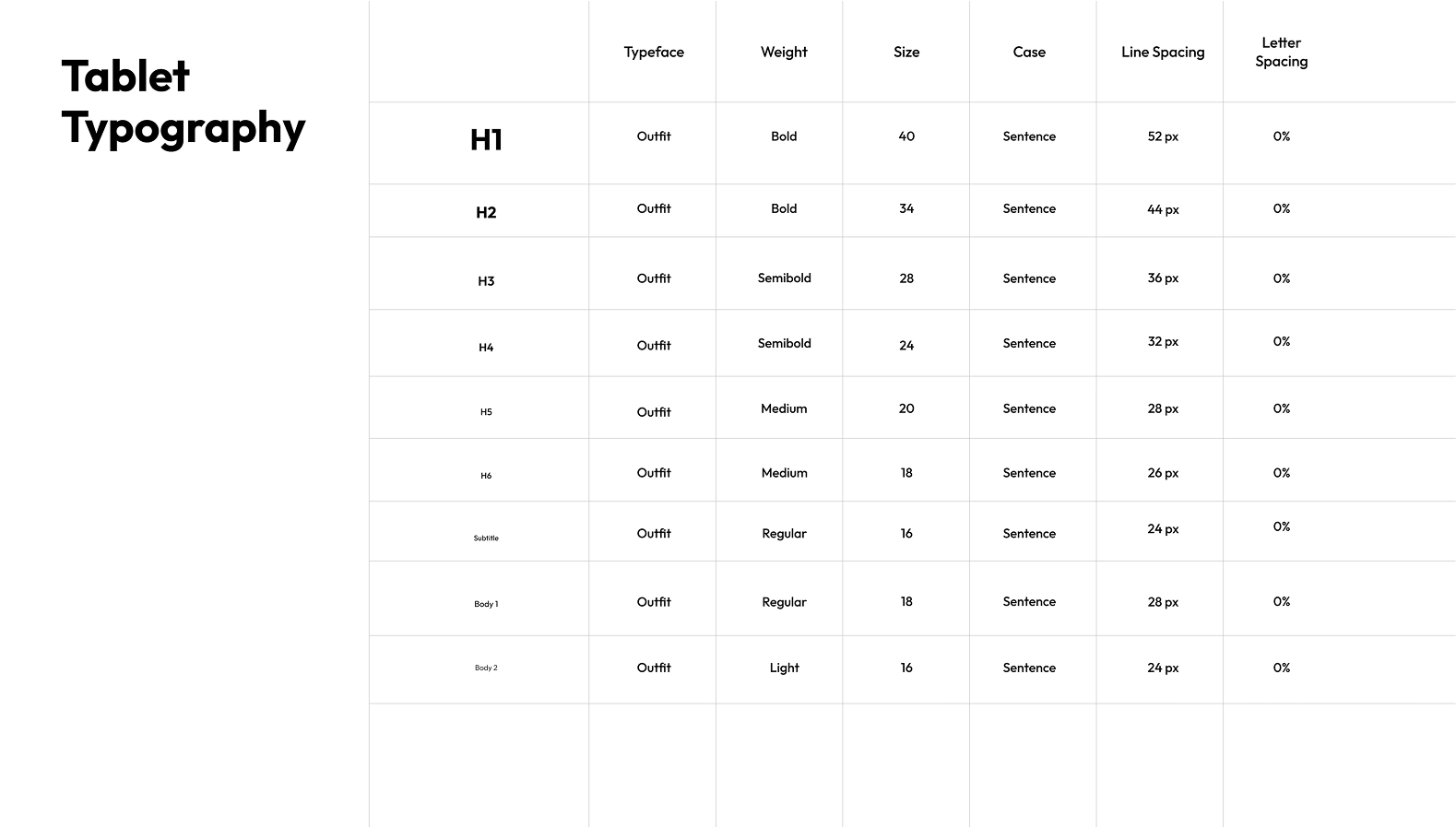
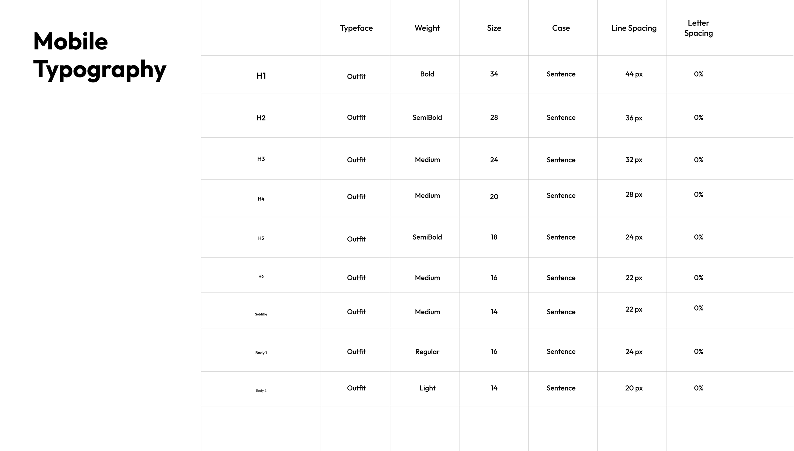
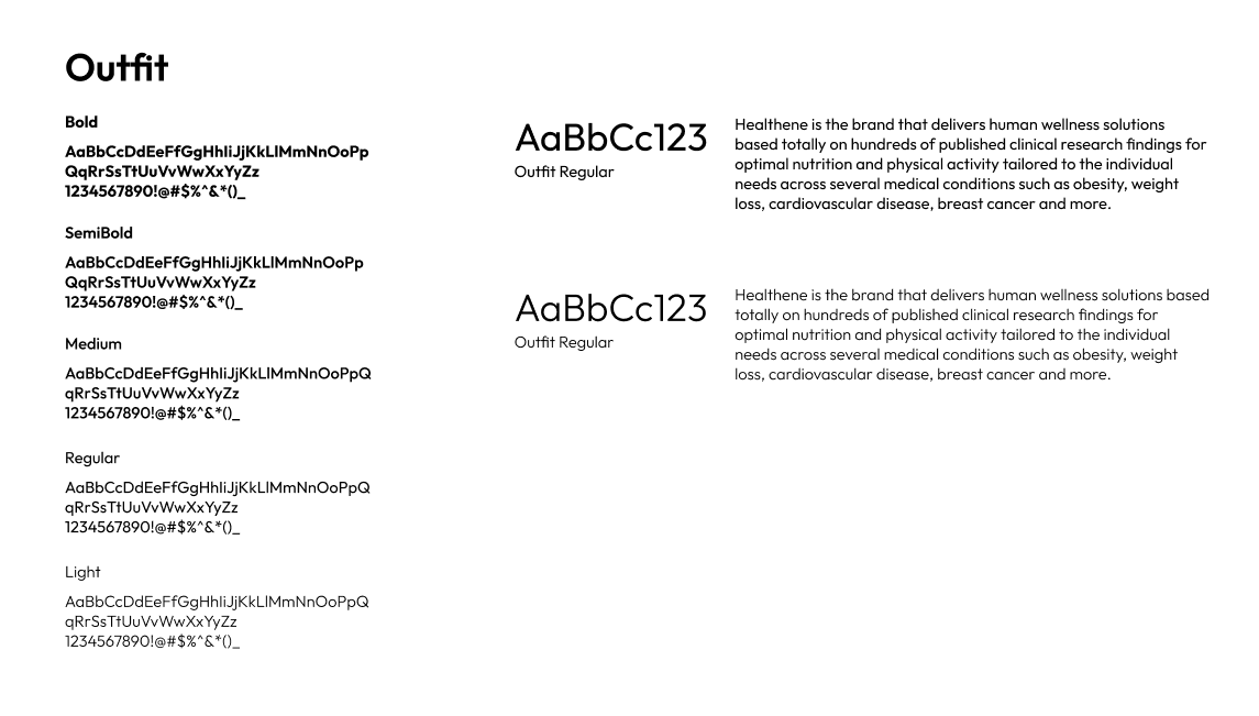
Design System — Colors & Typography
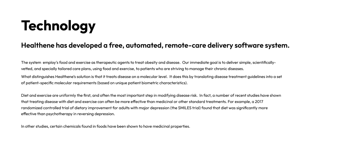
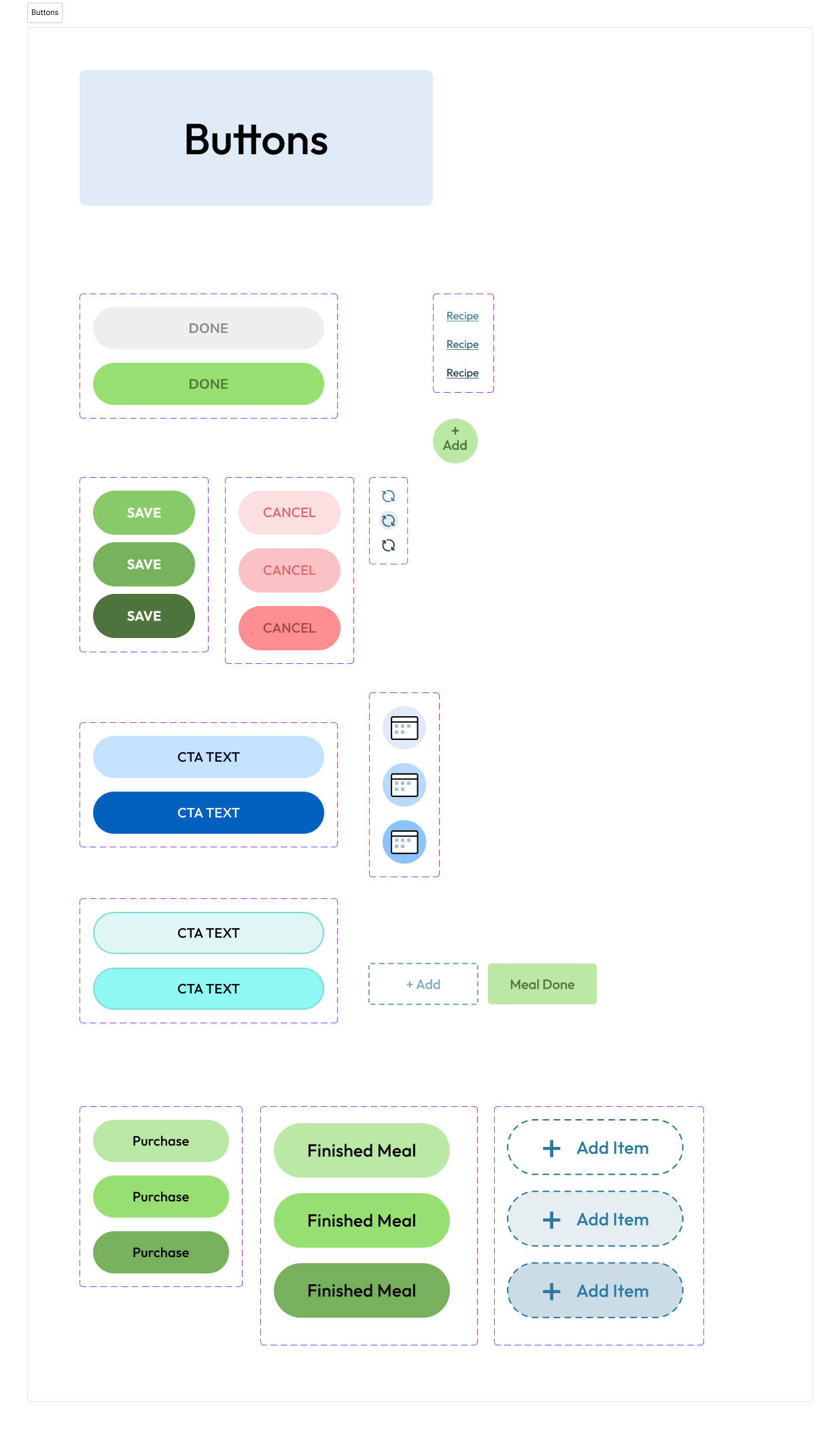
When I joined Healthene, a growing healthcare startup, there was no existing design system—just an outdated logo and a scattered visual identity. Recognizing the need for consistency, scalability, and user-centered design, I began building a comprehensive design system from the ground up. This ongoing project includes UX components for the app, a refined color palette, accessible typography standards, responsive spacing guidelines for both mobile and desktop, custom iconography, and a scalable button system. As with many startup environments, I juggle multiple responsibilities daily, but this design system continues to evolve as a foundational tool for clarity, efficiency, and brand cohesion across Healthene’s product ecosystem.
02
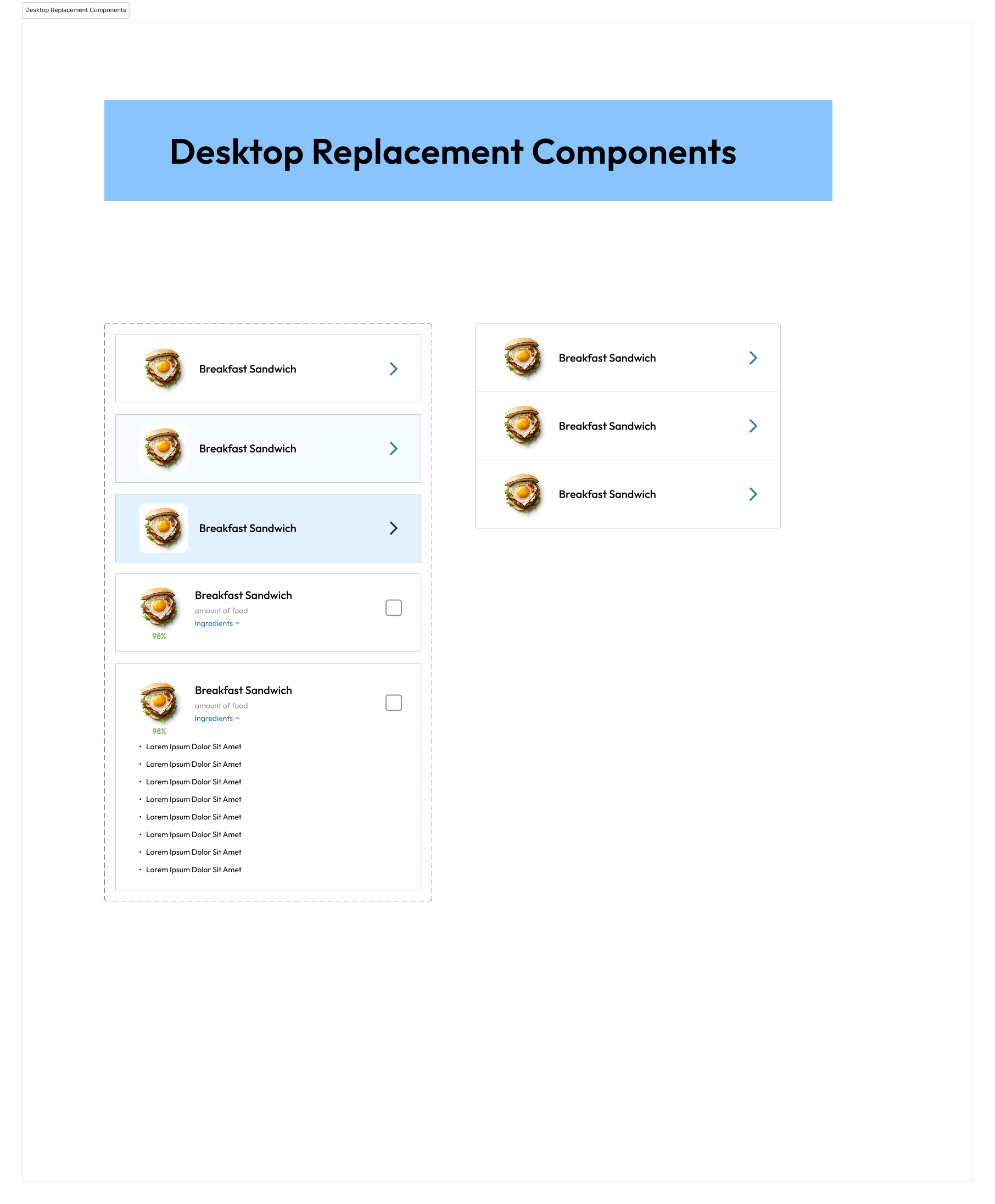
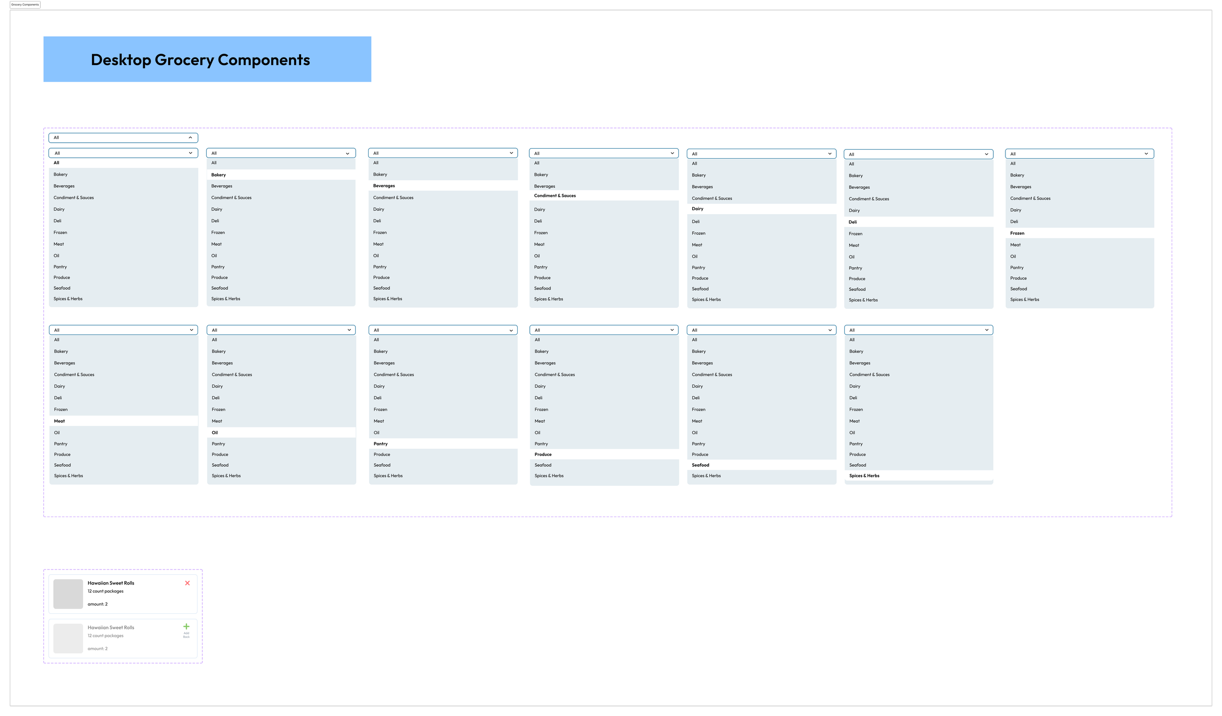
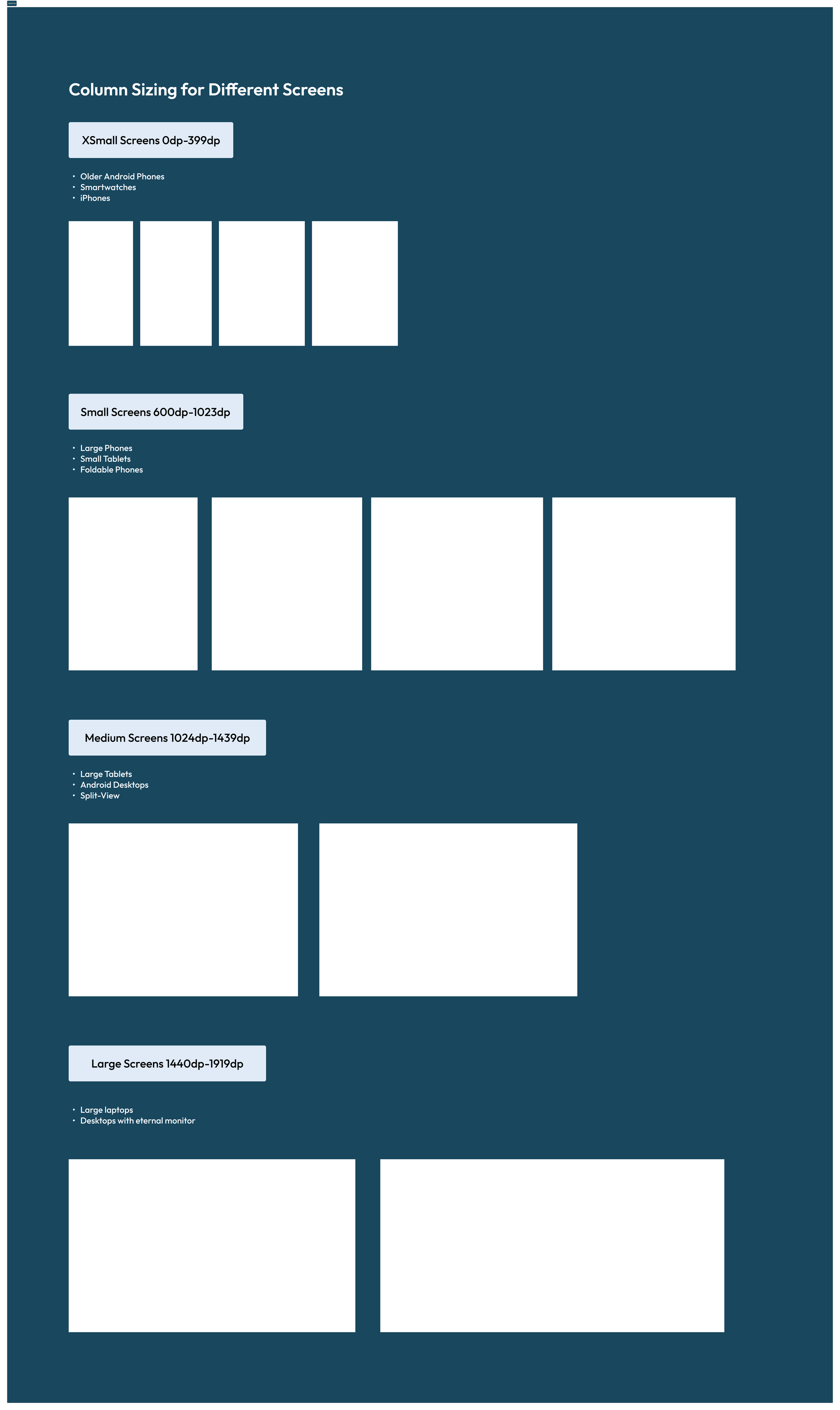
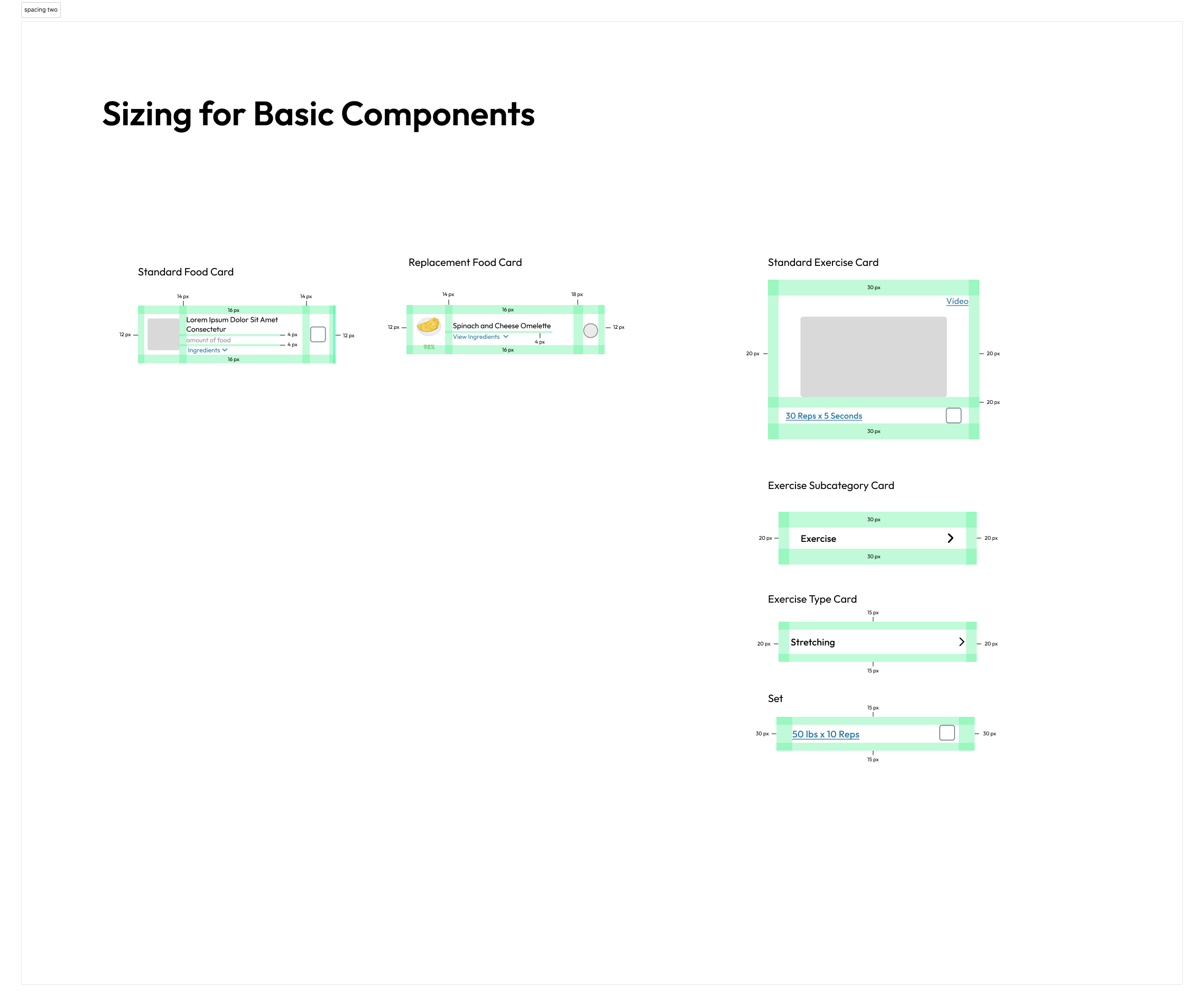
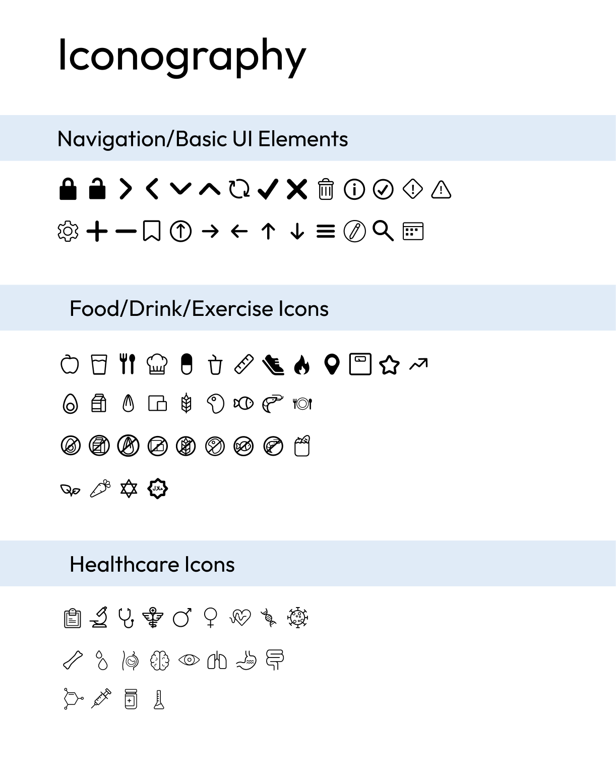
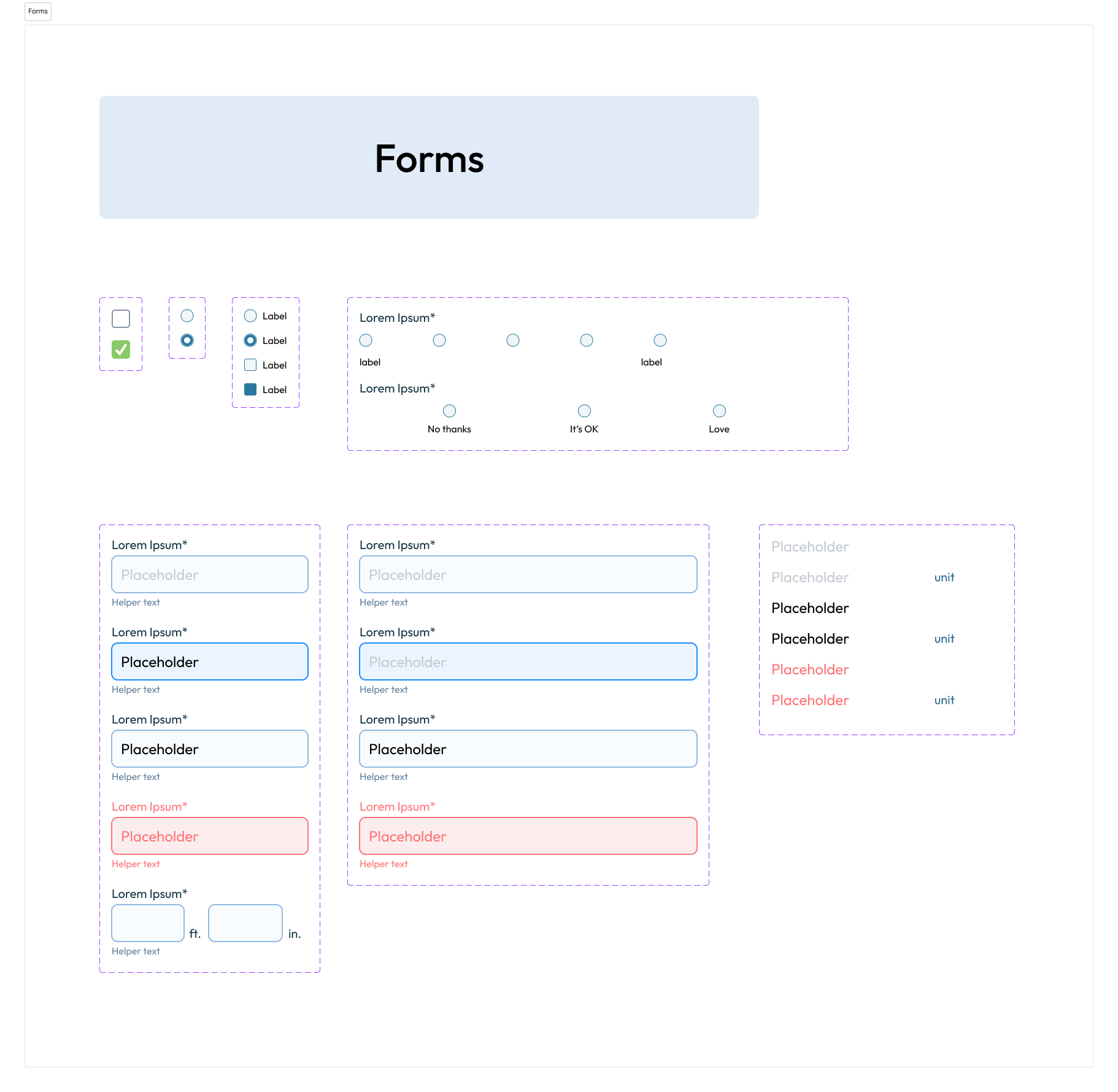
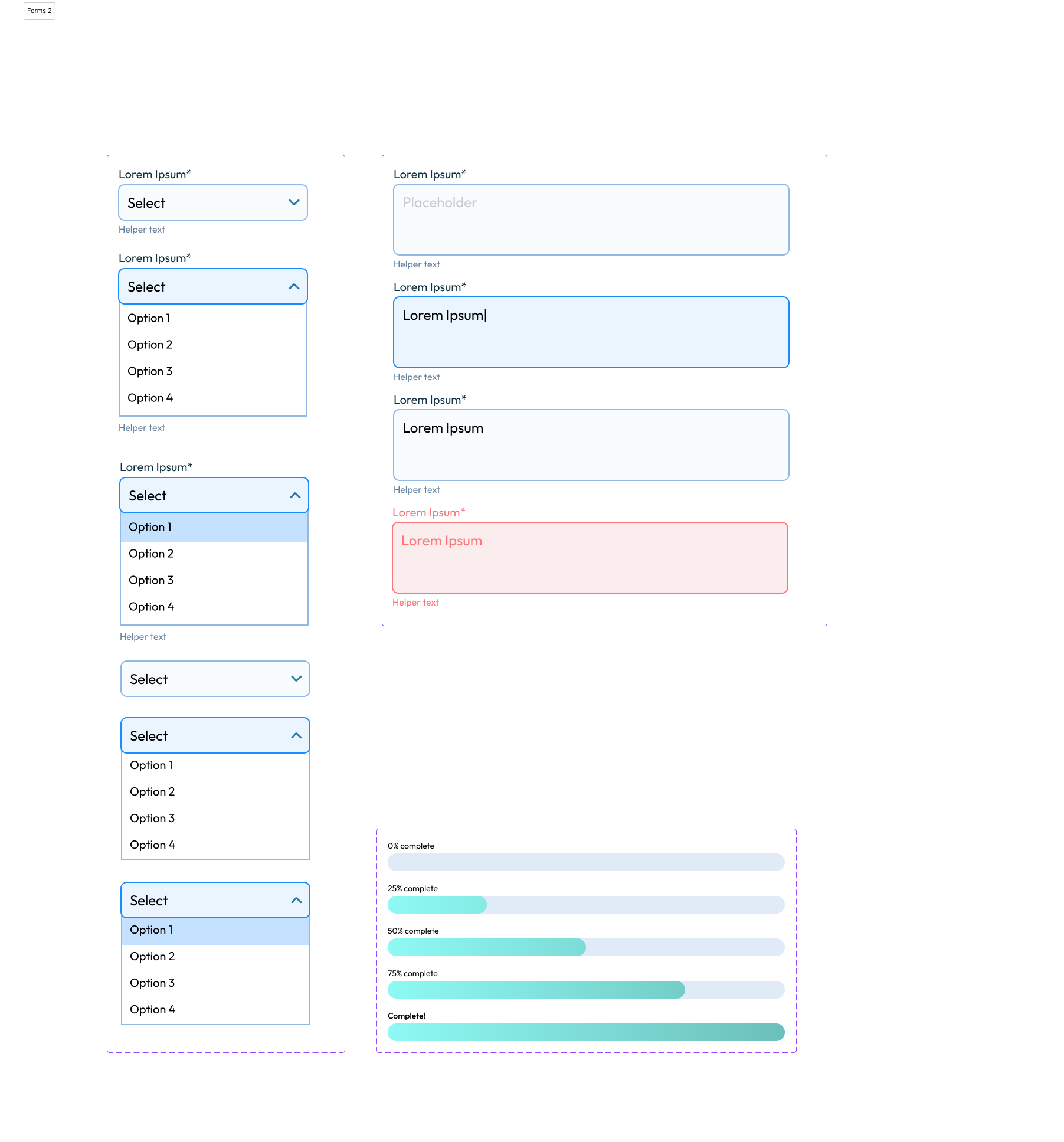
Design System — Iconography, Desktop & Mobile Components
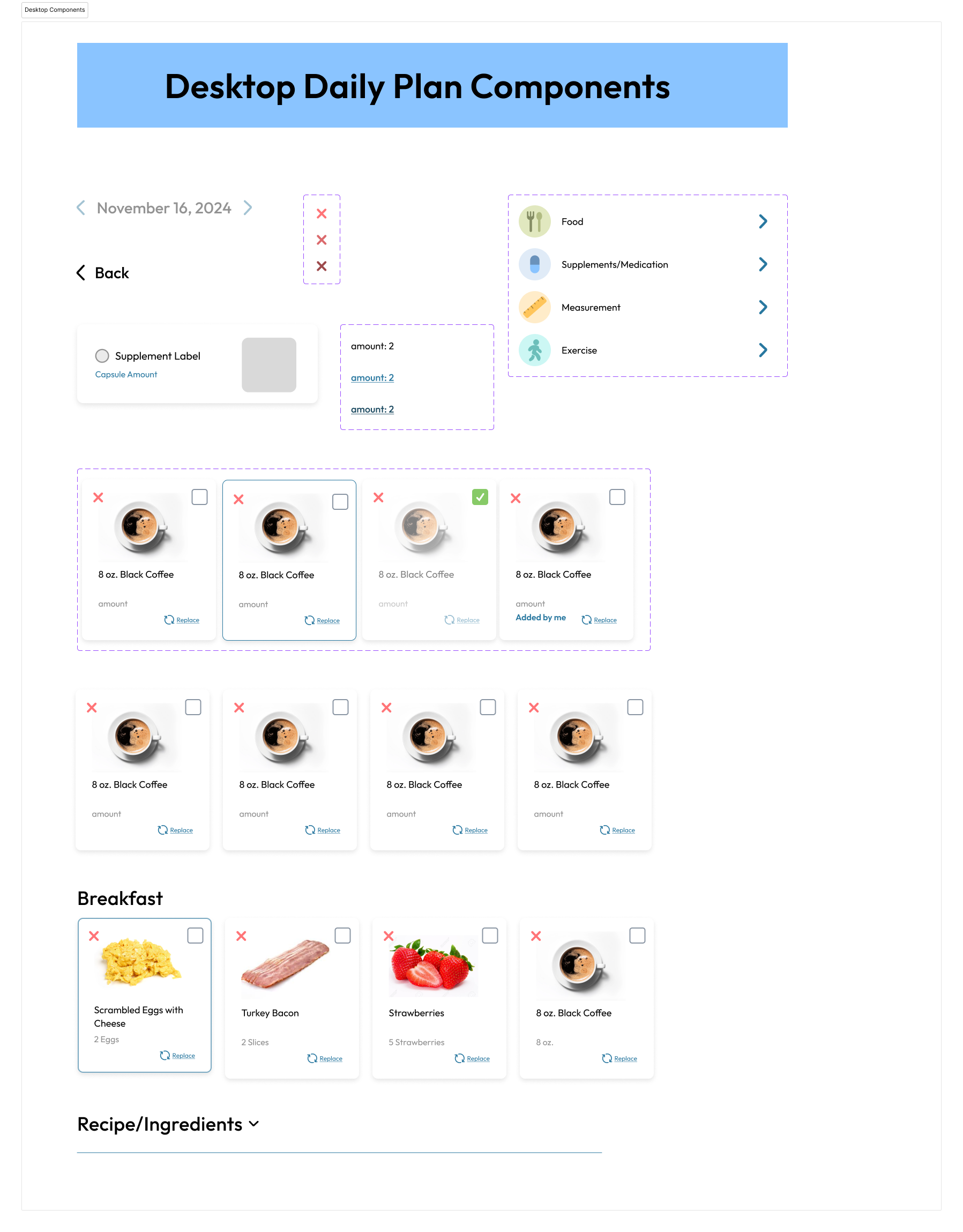
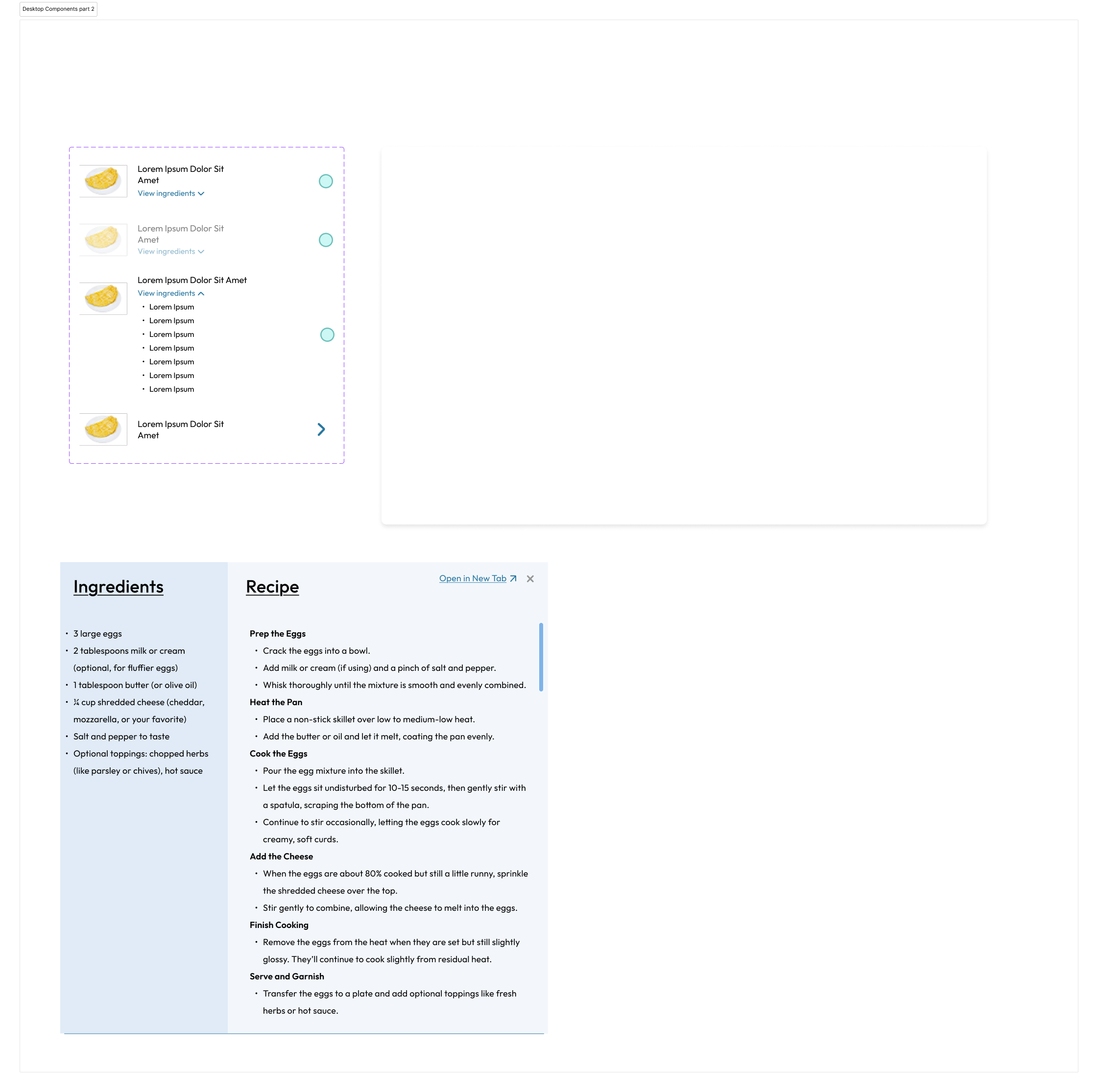
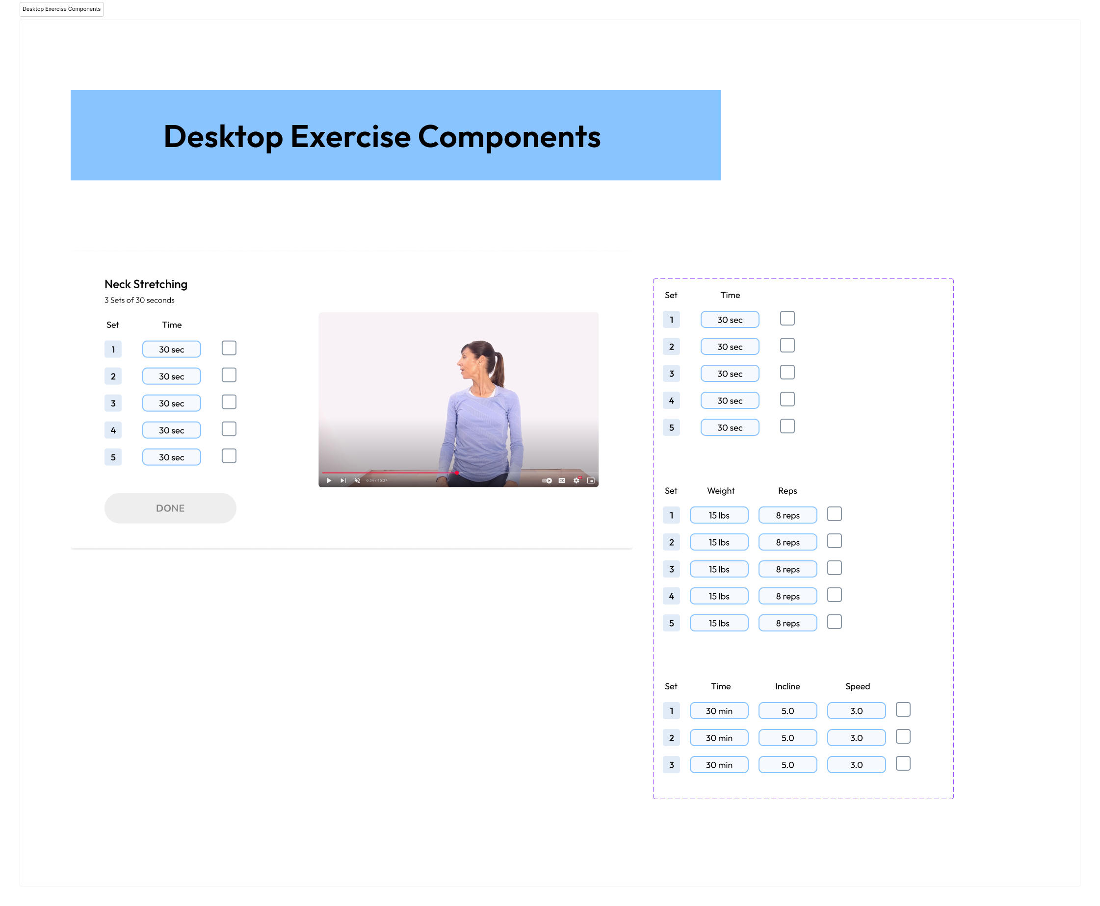
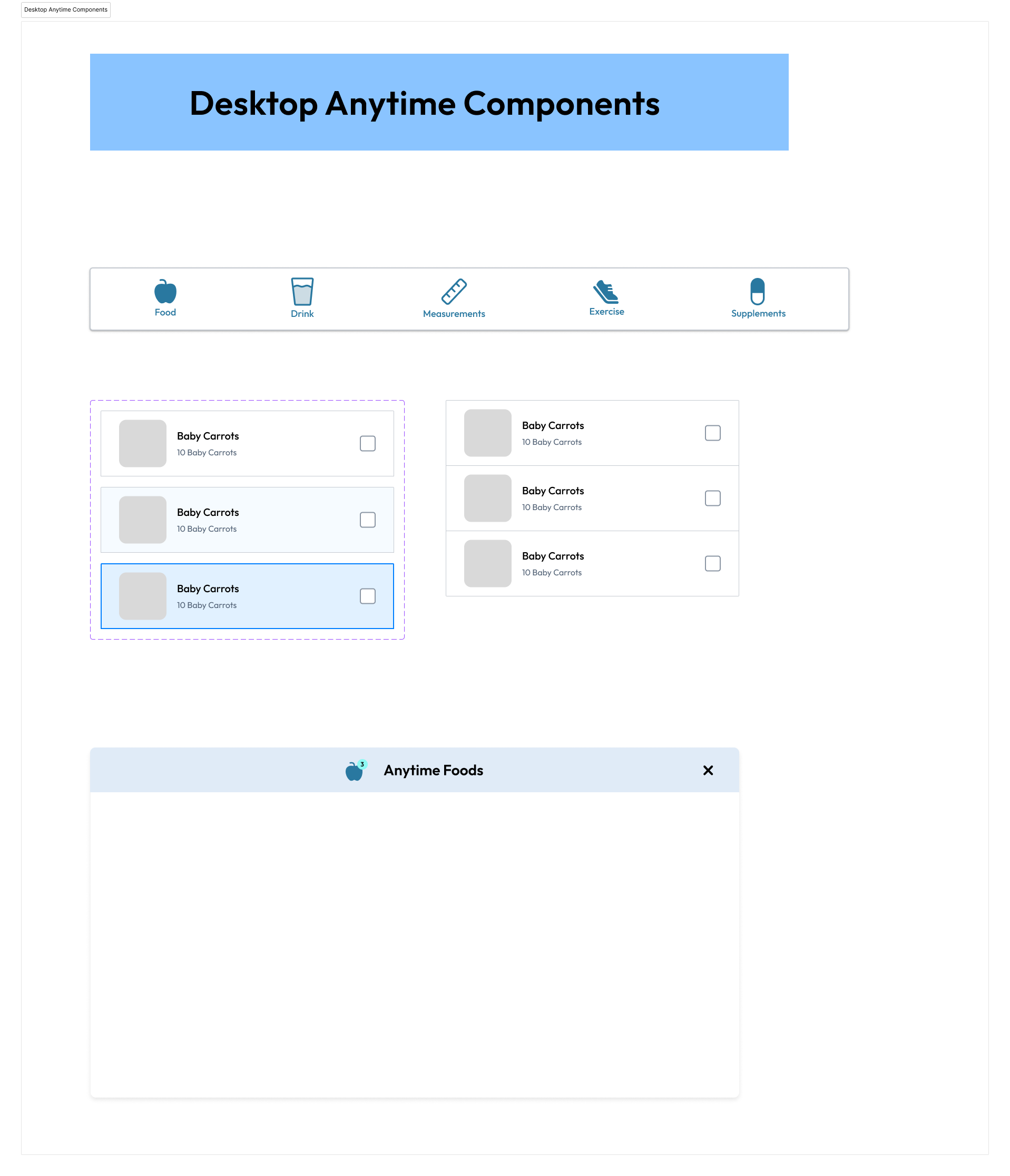
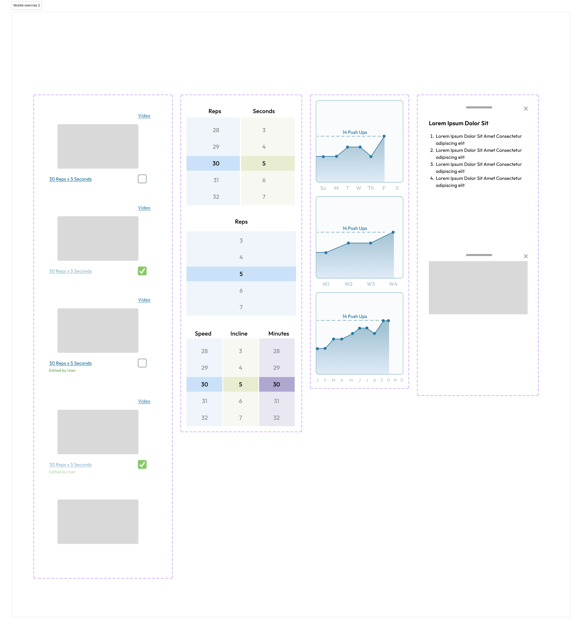
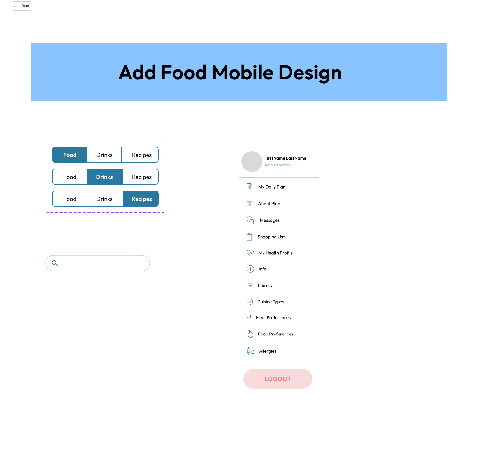
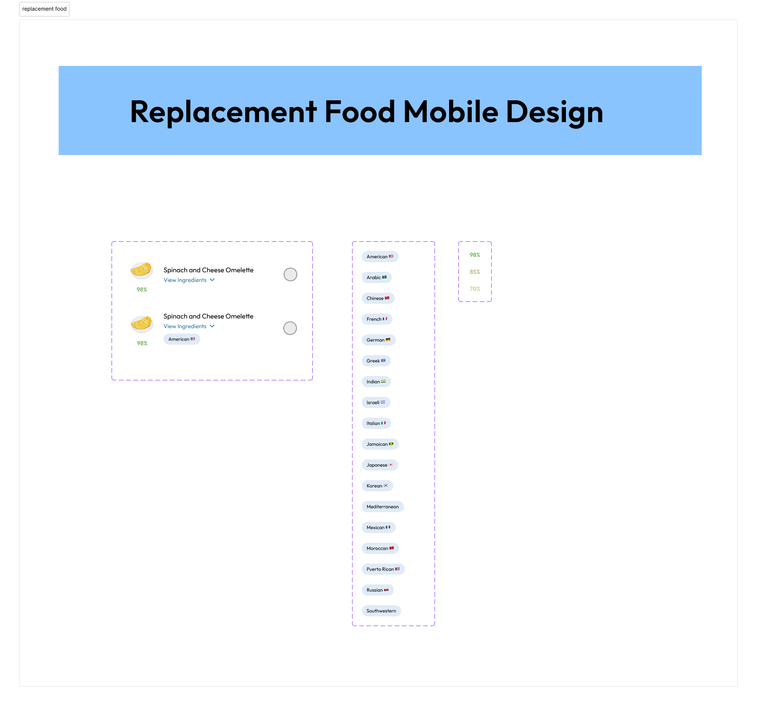
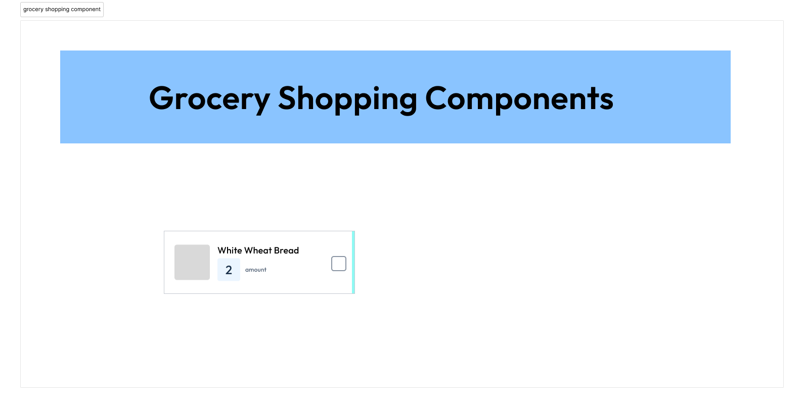
When I joined Healthene, a healthcare startup focused on disease prevention through nutrition, one of my first major tasks was building a scalable design system from the ground up. Working closely with the founder—who guided me through the science and tech behind the product—and the development team, I created standardized mobile and desktop components in Figma to bring visual and functional consistency to our application. This system not only established a clear visual language but also streamlined communication between design and engineering, allowing our team to work more efficiently as we scaled. From buttons and forms to typography, spacing, and responsive layouts, every element was built with accessibility, clarity, and long-term growth in mind.
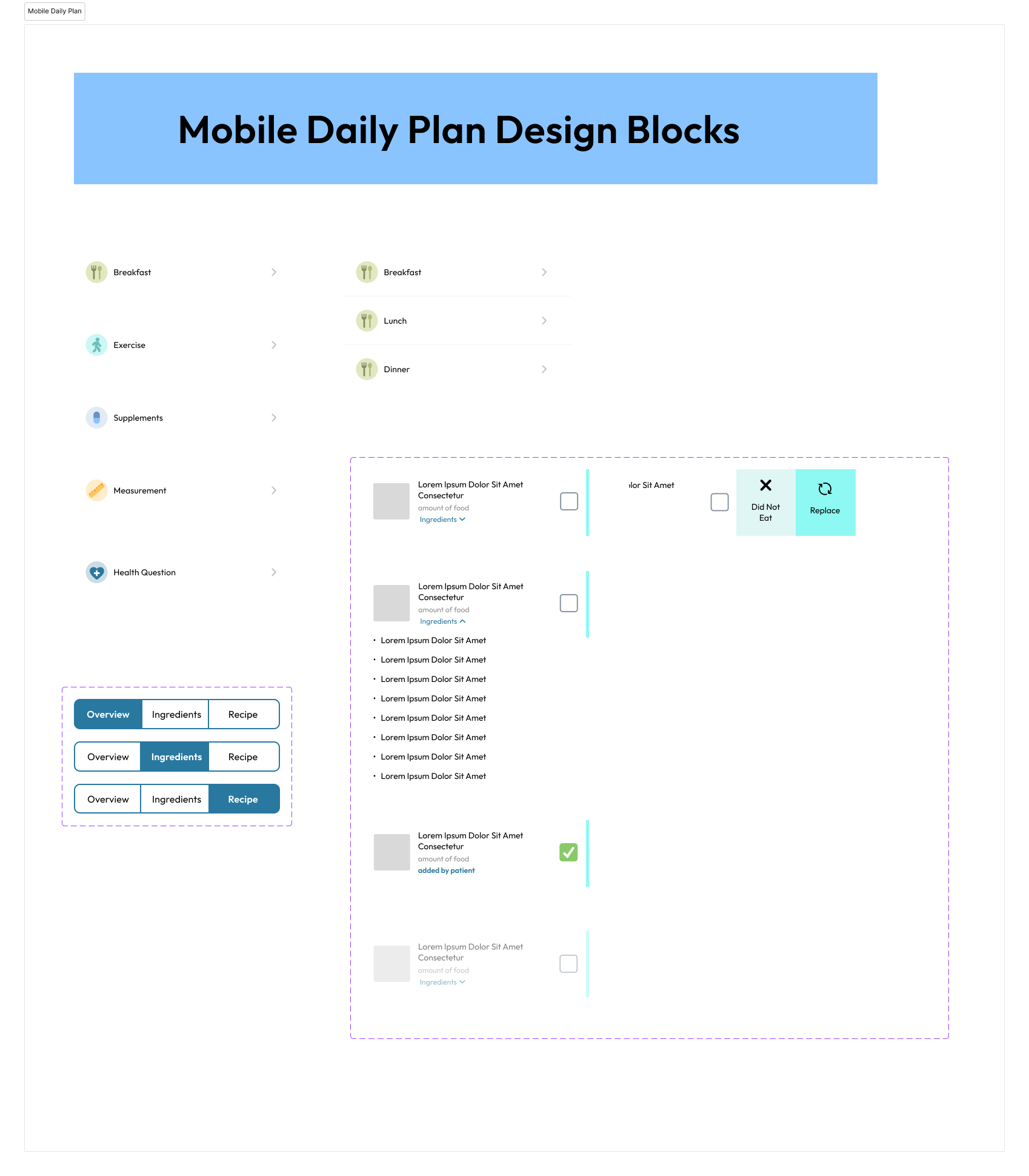
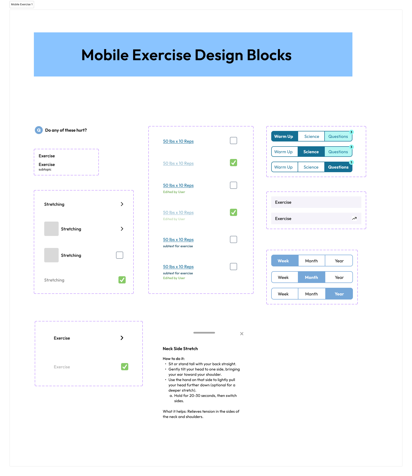
Mobile Components
Desktop Components